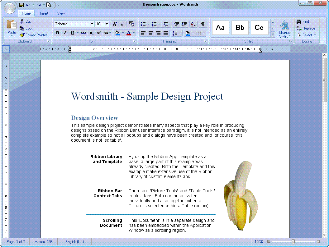
As a tribute to Microsoft Word, the application that essentially started the Ribbon UI movement, we've created a similar application prototype named "Wordsmith".
This prototype was initially created from the Ribbon App Template then edited and expanded to add further ribbon bar panels and a scrolling document area.
It also demonstrates how to use context tabs that only appear when certain elements in the document have been selected. A mechanism for showing selected objects is also included.
Install the Ribbon Library before using this project (not needed to open the .gdd file in the Viewer).

This is a typical structure for a ribbon bar application prototype project.
The "_Widgets" folder is a place to put any Custom Elements that you need to repeat throughout your project but also edit in each case (it's set as a Custom Elements Folder). The leading underscore ("_") keeps it sorted near the top of the tree where it's most handy.
The "Content" folder contains designs related to the application's content document and views.
The "Ribbons" folder has a separate sub-folder for each ribbon tab. Some ribbons can be contained within a single design but others might need multiple designs for popups and dialogs.
All remaining application designs can be placed at the top root level or in a separate sub-folder. The starting design (marked in green) should always be at the root level.
Most projects tend to have patterns of features that repeat throughout the design and, unlike Components, need to be modified in each case. That's where Custom Elements come in and it's typical to create a "_Widgets" folder in your project and use the right-click context menu on it to "Set as Custom Elements Folder" (as mentioned above).
This project has just a few custom widgets, such as the "Tabular Paragraph" below. In each case, the elements have been grouped so that they move together when selected (but can still be individually resized), and have Resize Anchors applied so that they become more reusable in different situations.

For example, the "Selected Object Box" (below) is constructed from 10 simple Rectangles, all grouped and with Resize Anchors applied. Note that there's an invisible background Rectangle (with no Fill or Border) that acts as a container for all the other elements and allows for a Visibility Condition to be applied to the whole custom element. This is used in the project to highlight selected objects when clicked.

Scrolling regions are created using a 2-step process:

The content design will typically use the full screen width (320 pixels for portrait, 480 for landscape) and be as high as it needs to be.
The best element to use as a background is the standard "Web Page Part" with Margins set to 9 pixels all around. This provides a nice border to snap content to and renders invisible so that whatever background you've used on the main screen (stripes anyone?) will show through.
If you're a neat-freak (like us) then you can set the "Web Page Part" background element to have a Fixed Width too. This will prevent you from accidentally changing the width.
If you're using a more complex background that needs to scroll with the content then you'll need to add that to the design here.
When you drag and drop your content part as a Component onto your screen, it will appear full size. All you need to do is make a few quick property changes to the Component and all will be well.
First check the "Maintain size" option on the "Style" tab so that it doesn't try to adjust itself to match the actual content size:

Then remove the "Fixed Width" and "Fixed Height" constraints (you might also want to set Resize Anchors at this point to automatically resize the content if the application Frame Window is resized):

Finally, all you need to do is resize the content Component to fit within the application window. At this point, the scroll bar will appear and, with the Component selected, you can actually scroll the content within the design.
Some of the icons in this project were kindly provided by FatCow Web Hosting:
http://www.fatcow.com/free-icons
Original high resolution images kindly provided by Min Thu and hongkiat.com:
http://www.hongkiat.com/blog/high-quality-fruits-stock-photos/
 Wordsmith.gdd
 Wordsmith project
Use the free Viewer to open distributed design projects (.gdd files) such as the samples on this site.
 FREE Viewer DownloadFREE Viewer Download
Use the free Viewer to open distributed design projects (.gdd files) such as the samples on this site.
FREE Viewer DownloadFREE Viewer Download